

How to choose a colour scheme for your living room
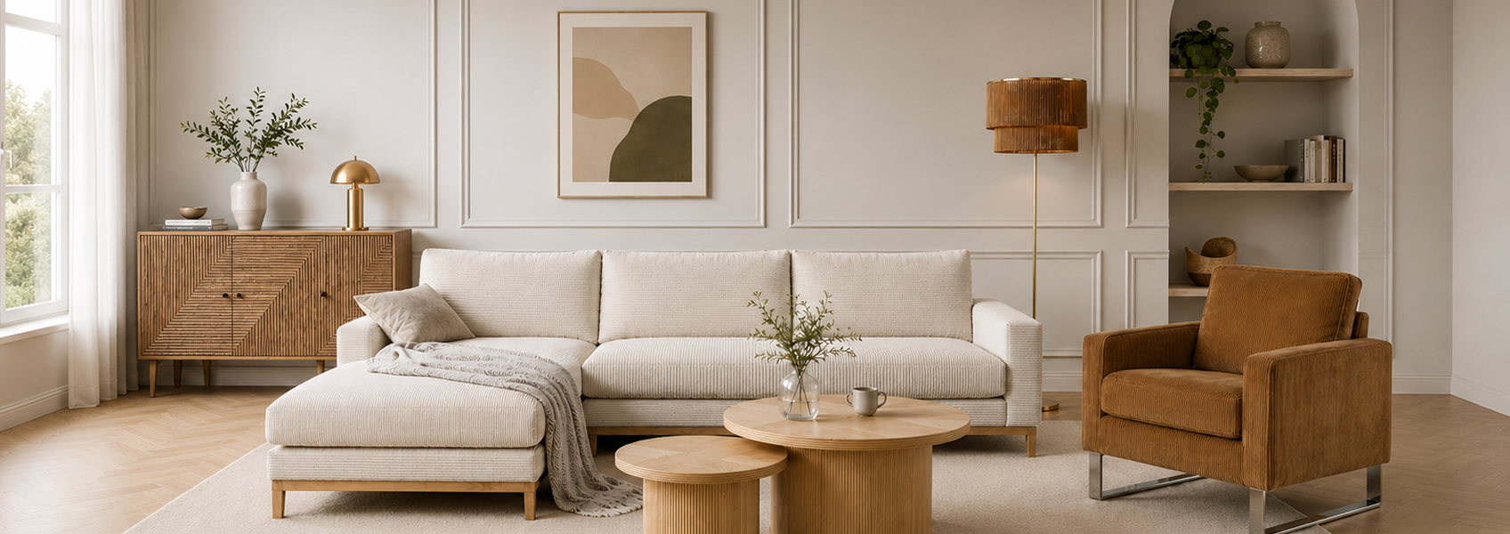
Nailing your living room palette is about more than just picking a shade you do not hate. It requires a strategic look at how natural light behaves in the room during the day, paired with a solid grasp of basic colour theory. Get this right, and you will transform a chaotic space into a beautifully balanced hub that actually feels like home.
The golden rule of spatial proportions
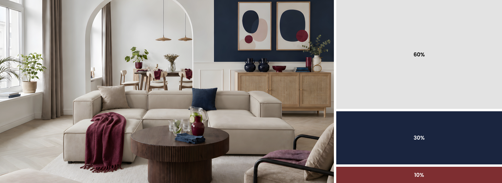
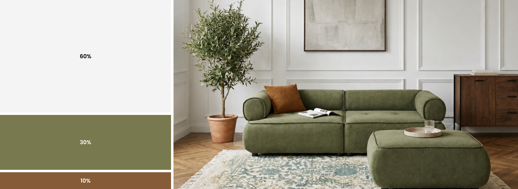
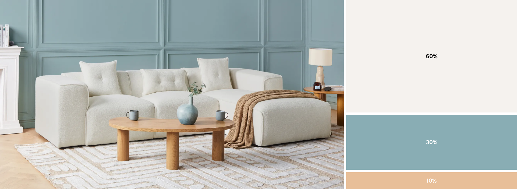
Before you rush to the local DIY store and buy five different sample pots, you need to understand balance. Interior designers rely heavily on the 60-30-10 rule to prevent a room from looking like a paint factory explosion.
- 60% dominant colour: This is your anchor, usually reserved for your walls, large area rugs, or primary sofa.
- 30% secondary colour: This shade provides visual interest and should look brilliant against your dominant hue. Think curtains, accent chairs, or a single feature wall.
- 10% accent colour: Your playground for personality. Use this sparingly on cushions, artwork, lampshades, and decorative accessories.
Decoding the impact of natural light
The exact same paint swatch can look entirely different depending on the room it’s in. Because the direction your windows face determines the warmth and intensity of the light entering the space, pigments shift constantly from morning to night. Understanding this relationship is the first step to transforming your walls with confidence.
To figure out which rule applies to your space, simply look to the sun. If your room is flooded with bright light first thing in the morning, it faces East. If it inherits a warm, golden glow in the late afternoon, it faces West. Rooms that enjoy intense, bright sun all day long face South, while spaces that receive steady, indirect light with no direct sunshine face North. Just observe your room at a few different points during the day, and you'll instantly know your direction.
North-facing rooms
These spaces receive cool, bluish light all day. Crisp whites or cool greys will feel clinical and cold. Opt for warm neutrals, soft terracotta, or rich yellow-based creams to bounce warmth back in.
South-facing rooms
Bathed in warm, golden light most of the day. Highly versatile, but cool blues, pale greens, and soft charcoals work exceptionally well to balance out the intense afternoon sun.
East & West-facing
The chameleons. East-facing rooms turn shadowy by evening (ideal for warm greys), while West-facing rooms inherit a warm late glow. Neutral backdrops with vibrant accents hit the sweet spot.
Trends, taste, scale, or neutrals: what dictates the primary hue?
When selecting that dominant 60% anchor, the internet will inevitably try to sell you on the trend of the week. However, blindly following seasonal fads is a fast track to repainting in twelve months because you are utterly sick of looking at a living room that resembles a trendy but soul-crushing corporate showroom. Instead, your primary colour choice should be a pragmatic negotiation between your architecture, your lifestyle, and a proper understanding of paint undertones.
To settle on your perfect base shade without any future regrets, evaluate your room against these four key criteria:
The architectural scale
Small European flats, classic Victorian terraces, and cosy cottages benefit immensely from a strict respect for spatial dimensions. If your square footage is at a premium, leaning towards a light, light-reflective primary colour will visually stretch the boundaries of the space. Conversely, a cavernous lounge can easily handle the dark intimacy of a moody charcoal, deep navy, or rich forest green.
The neutral trap
Do not mistake "neutral" for "foolproof". Neutrals are chameleons driven entirely by their undertones—yellow, pink, green, or blue. A cool, blue-based grey that looks crisp in a south-facing Parisian apartment will look dead, flat, and clinical in a shadow-heavy sitting room. Always test whether a neutral is warm-toned or cool-toned in your daylight.
Your personal preference
Trends are fleeting, but your daily routine isn't. Build your primary palette around how you actually use the space rather than social media feeds. If you use the room to wind down after work, lean into calming, low-contrast palettes; if you entertain often, you can afford to be braver with your foundational depth.
The nature of trends
Never let a temporary craze dictate permanent fixtures or main walls. If you love a trending hue—like energetic terracotta or dramatic jewel tones—leave it out of your 60% base. Use these shades exclusively for 10% accent pieces (cushions, throws, artwork) that can be effortlessly swapped.
Not sure what's trending? Browse our trends selection
Three foolproof palettes that always work
If you are staring blankly at a colour wheel and feeling completely overwhelmed, stick to these classic, crowd-pleasing combinations that have stood the test of time across modern European homes:
The botanical retreat
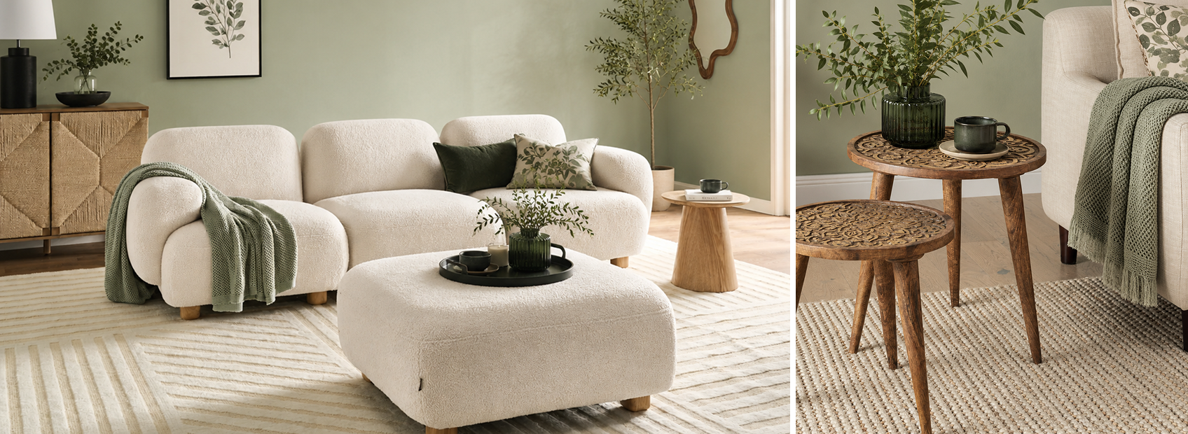
This nature-inspired scheme relies on a grounding base of sage green walls (60%) to establish a serene atmosphere. Layer in soft cream furnishings (30%) to keep the space feeling bright and airy, and finish with rich forest green or matte black accents (10%) for sharp, modern contrast. It is a highly calming combination that works brilliantly for urban homes or any space lacking a view of the outdoors.
The sophisticated neutral
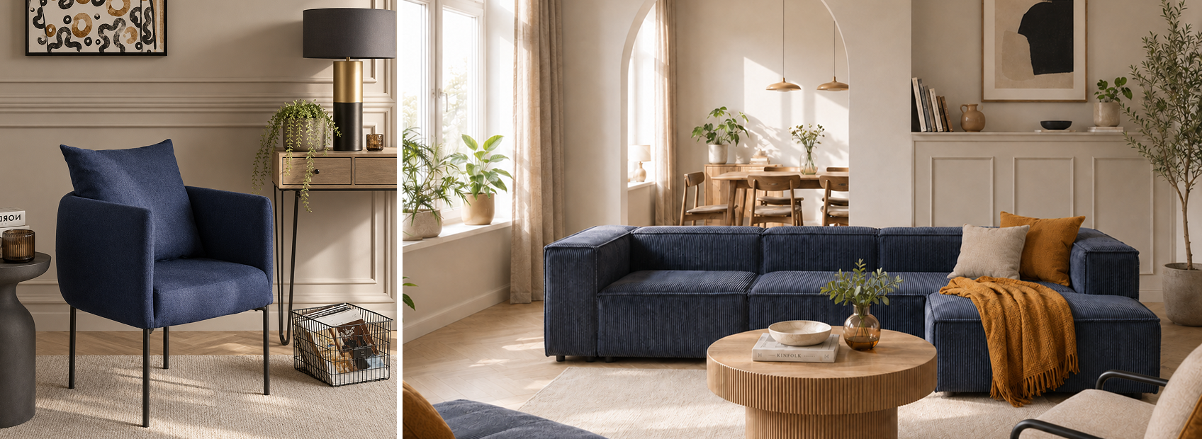
For a contemporary look that feels both cozy and refined, begin with warm greige walls (60%) to create a soft, inviting backdrop. Complement the walls with charcoal grey upholstery (30%) to add depth and structure to the room. Finally, introduce muted mustard yellow or burnt orange accessories (10%) to inject a subtle pop of energy and personality without overpowering the understated aesthetic.
The classic coastal
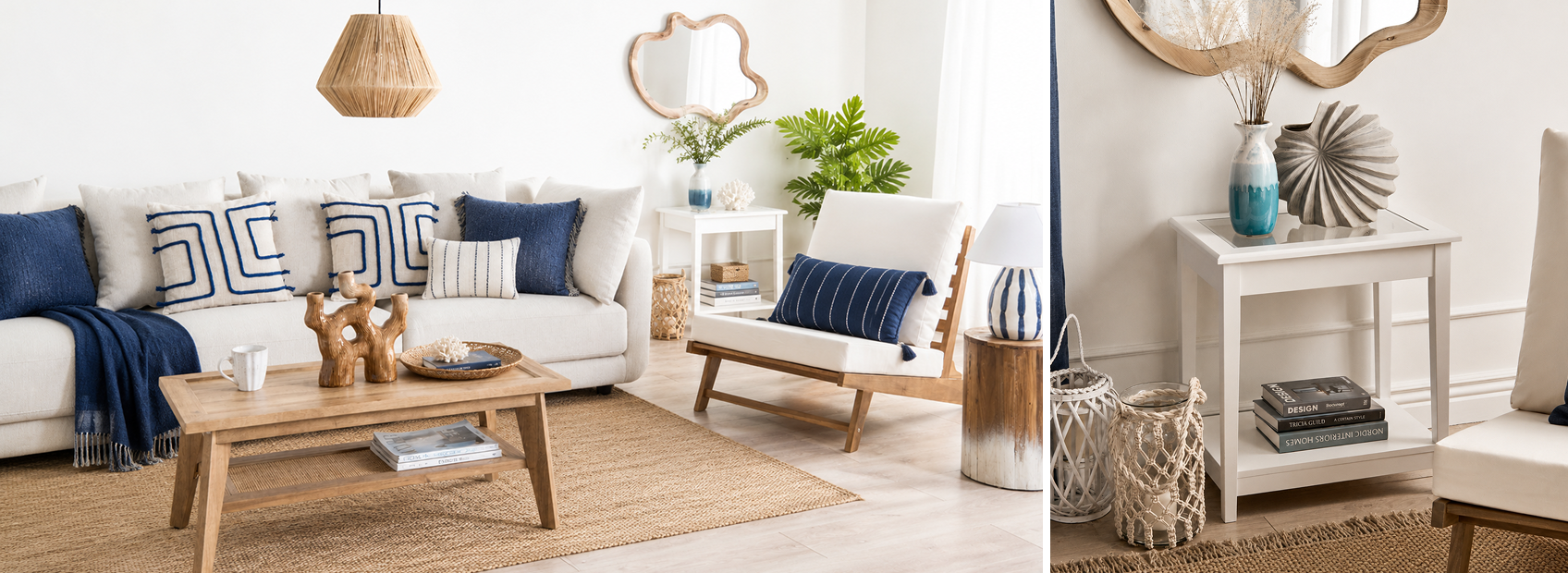
Embrace a fresh, breezy aesthetic by starting with crisp off-white walls (60%) to maximize natural light and openness. Introduce deep navy denim textiles (30%) through curtains, rugs, or sofas to bring in a sense of classic, structured comfort. To complete the look, use natural jute or tan leather accents (10%) to add essential warmth, texture, and organic grounding to the space.
